Mossmj13 Posted January 30, 2020 Posted January 30, 2020 https://detroit.craigslist.org/mcb/pts/d/saint-clair-shores-custom-cnc-machined/7057732097.html
NHMJXJ Posted January 30, 2020 Posted January 30, 2020 https://detroit.craigslist.org/mcb/pts/d/saint-clair-shores-custom-cnc-machined/7057732097.html Starting at $50 bucks each, price goes up with size CNC machined out of 6061 billet aluminum Can make any emblem you’d like Text or call 5ate6-59six-7ate57 Will ship anywhere in the USA for free!
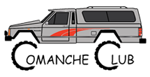
Jeep Driver Posted February 5, 2020 Posted February 5, 2020 Something a little strange there.........wonder if any of you see it?
Pete M Posted February 5, 2020 Posted February 5, 2020 aside from the black background blobs being not quite the same?
eaglescout526 Posted February 5, 2020 Posted February 5, 2020 The lettering is not accurately round despite being cut from a computer program.
CoastChief Posted February 5, 2020 Posted February 5, 2020 The font is off, if you study the lettering. Take the ( m ) for example, the stock has a bolder look. The ( a ) ends different in the back bar of the A, in addition the letter opening has a rounder shape. Looking at the back end of the A you can see there is a taper. Regardless, they look really great!!!
ghetdjc320 Posted February 13, 2020 Posted February 13, 2020 I had the originals vector traced and posted the file here on the forum somewhere. This guy could use those as a template since it would be precise

Recommended Posts
Create an account or sign in to comment
You need to be a member in order to leave a comment
Create an account
Sign up for a new account in our community. It's easy!
Register a new accountSign in
Already have an account? Sign in here.
Sign In Now